Data Questions
Who is eligible?
Who requests assistance?
Who do we help?
How do we help?
What resources are required?
Geographic Concentration
Does the geographic concentration of intakes match the concentration of served people?
Does the geographic concentration of intakes match the concentration of served people with specific demographics?
Does the geographic concentration of intakes match the concentration of served people from your defined groups?
Does the geographic concentration of intakes match the concentration of served people with specific categories of legal problems?
Does the geographic concentration of intakes match the concentration of served people with specific legal problems?
What is the geographic concentration of served people compared to the geographic concentration of people not served?
Geographic Concentration
Geographic Concentration analyses compare geographic concentrations (high or low) of multiple variables to determine how the variables and location impact each other. Our concentration maps display location quotients.
Example Data Question
How does the proportion of people we serve from different parts of our service area compare to the proportion of eligible people in those same areas?
Multiple Analyses Are Possible
- Identifying concentration allows you to move beyond questions of “high/low” to questions of “more than expected or less than expected”.
- The location quotient is a commonly used measure of concentration, and it can yield important insights into the data.
- Are there communities in your service area generating fewer than expected served cases (LQ <1)? Why might that be?
- Are there communities in your service area generating more than expected served cases (LQ>1)? Do you know why?
- Are levels of concentration throughout your service area (the distribution of LQs on a map) the result of a conscious effort on the part of your organization, or is it simply determined by the population seeking your services?
Data Sources
Closed Case data from your case management system, including:
- Data that indicates whether the case was served, such as closing code and/or case status
- Open date and close date
- County (or other geographic field such as zip code)
- Other case information that you might be able to use in other analyses, demographics, etc.
- Exclude cases that were identified as errors or duplicates and cases that ended up not being served
U.S. Census American Community Survey data at the American Factfinder website: http://factfinder2.census.gov (Advanced Search option)
- S1701: POVERTY STATUS IN THE PAST 12 MONTHS, 5 year estimate, by Census Tracts
Example Analyses Steps
- Export the total cases closed and served from your CMS to a spreadsheet for the most recently completed year or the most recent year for which the ACS S1701 table is available.
- Sort the served cases by county. Review the counties and remove any that aren’t actual county names or aren’t in your service area. You may have to combine data if counties show up with multiple spellings.
- Subtotal all served cases. Then, calculate the percentage of served cases in each county.
- Open the S1701 table and calculate the total poverty population for the state by adding up the Below Poverty Level Estimate column for each county. Then calculate the share of the total poverty population for each county. Add these percentages to a new column in your served cases spreadsheet.
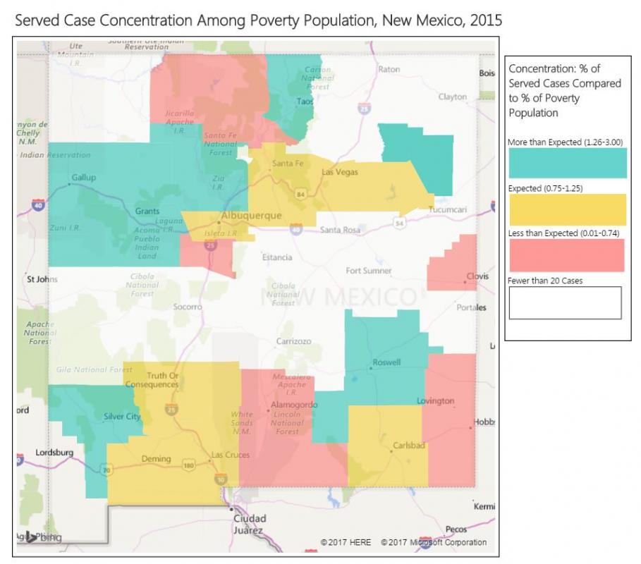
- In a new column called Concentration, calculate the location quotient by dividing the served cases % for each county by the % share of the poverty population and divide that amount by 100. Results that are below 0.75 indicate that fewer clients were served than would be expected in that county based on its share of the state’s poverty population. Results that are between 0.75-1.25 indicate that the expected share of clients were served based on that county’s share of the state’s poverty population. Results that are above 1.25 indicate that more clients were served than would be expected in that county based on its share of the state’s poverty population.
- Create a column called Concentration Ranges in which you enter these categories: “0.01-0.74”, “0.75-1.25”, “1.25-3.00”, and “Less than 20 cases” (enter a threshold number of cases under which you will not display the concentration data).
- You should have a spreadsheet that simply shows County, Total Cases, Concentration, and Concentration Ranges.
- Login to Microsoft Power BI (create an account if you don’t already have one).
- Click on Get Data, then Excel, find the spreadsheet you just created, and click Open. Note that your spreadsheet will need to be in Microsoft Excel Worksheet format for Microsoft Power BI to import it into your document.
- Double click on the name of the sheet in your spreadsheet and then click Load.
- Insert a Filled Map Visualization.
- Enter County as Location and Concentration Ranges as Legend.
- Adjust the formatting as you prefer to show the variation in Concentration Ranges by county. Make the counties with Fewer than 20 Cases shaded white.
- Use the automatic Legend or create your own using shapes with titles.
- In order to include the map in other documents, you will have to take screen shots.