Data Questions
Who is eligible?
Who requests assistance?
Who do we help?
How do we help?
What resources are required?
Geographic Distribution
Where do the people receiving brief vs. extended service live?
Where do people receiving brief vs. extended service with different demographics live?
Where do people receiving brief vs. extended service from your defined groups live?
Where do people receiving brief vs. extended service with certain categories of legal problems live?
Where do people receiving brief vs. extended service with different legal problems live?
Where do people with various outcomes live?
Geographic Distribution
Geographic Distribution analyses show how people or problems or anything else of interest is distributed across service areas, which can be divided into smaller areas to reveal spatial patterns. These patterns are opportunities to learn about the spatial dimensions of your organization and your clients.
Example Data Question
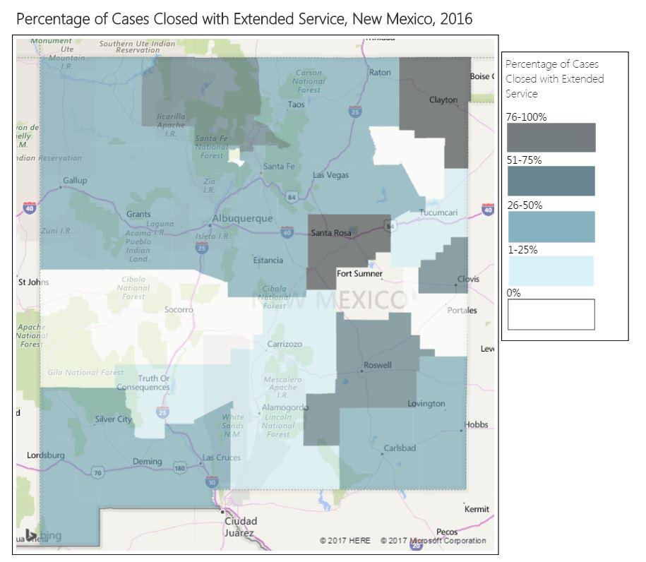
In what counties do we provide more extended service than brief service?
Multiple Analyses Are Possible
- Are certain types of cases that require more time or less time coming from specific geographic areas?
- Do we tend to provide extended services for clients who live near our offices?
Data Sources
Closed Case data from your case management system, including:
- Data that indicated the level of service provided, such as closing code
- Open date and close date
- County (or other geographic field such as zip code)
- Other case information that you might be able to use in other analyses, demographics, etc.
- Exclude cases that were identified as errors or duplicates and cases that ended up not being served
Example Analyses Steps
- Export the total cases closed (exclude cases not served) from your CMS to a spreadsheet for the most recently completed year.
- Sort the cases by county. Review the counties and remove any that aren’t actual county names or aren’t in your service area. You may have to combine data if counties show up with multiple spellings.
- Subtotal all cases closed, cases closed with brief service (closed with A or B), and cases closed with extended service (closed with F-L). Then, calculate the percentage of cases closed with brief service and extended service in each county.
- You should have a spreadsheet that simply shows County, Total Cases, Brief Service Cases, Extended Service Cases, % Brief Service Cases, and % Extended Service Cases.
- Login to Microsoft Power BI (create an account if you don’t already have one).
- Click on Get Data, then Excel, find the spreadsheet you just created, and click Open. Note that your spreadsheet will need to be in Microsoft Excel Worksheet format for Microsoft Power BI to import it into your document.
- Double click on the name of the sheet in your spreadsheet and then click Load.
- Insert a Filled Map Visualization.
- Enter County as Location and % Extended Service Cases as Legend.
- Adjust the formatting as you prefer to show the variation in Extended Services by county.
- Use the automatic Legend or create your own using shapes with titles.
- In order to include the map in other documents, you will have to take screen shots.