Data Questions
Who is eligible?
Who requests assistance?
Who do we help?
How do we help?
What resources are required?
Comparison
How do the hours by substantive area compare?
How do the hours by legal problem code compare?
How do the hours by funding code compare?
Comparison
Comparison analyses review linkages between two or more variables and uncover information about client conditions and data relationships. When unexpected data relationships are discovered, investigation is warranted to better understand linkages and determine whether they indicate the need for client service and advocacy work that simultaneously targets multiple conditions at once.
Example Data Question
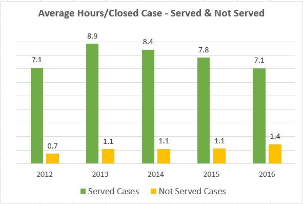
What is the average hours per case that we spend on cases that we serve versus those we cannot serve?
Multiple Analyses Are Possible
- Are we spending more time than we should on cases that we close with case status or close codes that indicate we were not able to serve the client? If so, should some of those cases be closed with service?
Data Sources
Intake and Closed Case data from your case management system, including:
- Fields that determine whether a client was served or not, such as case status and/or close code
- Fields that show hours worked on cases
- Problem codes
- Open date and close date
- Other case information that you might be able to use in other analyses, demographics, etc.
- Exclude cases that were identified as errors or duplicates, but make sure to keep cases that ended up not being served
Example Analyses Steps
- Export the total cases closed (including served or not served) from your CMS to a spreadsheet for the most recently completed five years.
- Sort the cases by whether they received service or did not receive service (usually based on closed code and/or case status).
- Subtotal the hours worked for served and not served cases for each year and divide the total hours by the total number of served and not served cases to get average hours per case for each year.
- Create a graph within Crystal Reports, Excel, or whichever analysis software you prefer (Excel Column Chart shown in this example) that shows the average hours per case for served and not served cases each year.
- Give served cases a different color from not served cases to make the graph easy to understand.