Data Questions
Who is eligible?
Who requests assistance?
Who do we help?
How do we help?
What resources are required?
Geographic Distribution
For cases in which geographic area are hours spent?
In what areas are the most staff and pro bono hours worked?
Geographic Distribution
Geographic Distribution analyses show how people or problems or anything else of interest is distributed across service areas, which can be divided into smaller areas to reveal spatial patterns. These patterns are opportunities to learn about the spatial dimensions of your organization and your clients.
Example Data Question
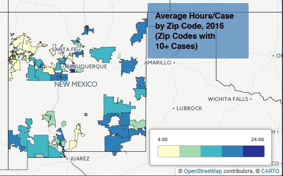
Does the average hours per case that we spend on cases vary by clients’ zip codes?
Multiple Analyses Are Possible
- Are certain types of cases that require more time or less time coming from specific geographic areas?
- Do we tend to spend more time on cases for clients who live near our offices?
Data Sources
Closed Case data from your case management system, including:
- Hours worked on cases
- Open date and close date
- Zip Code (or other geographic field such as county)
- Other case information that you might be able to use in other analyses, demographics, etc.
- Exclude cases that were identified as errors or duplicates, but make sure to keep cases that ended up not being served
Example Analyses Steps
- Export the total cases closed (including served or not served) from your CMS to a spreadsheet for the most recently completed year.
- Sort the cases by zip codes. Review the zip codes and remove any that aren’t actual five-digit zip codes. You may have to combine data if zip codes show up in multiple ways (such as “87022” and “87022-“)
- Subtotal the hours worked and number of cases by zip code. Then, calculate the average hours per case for each zip code.
- You should have a spreadsheet that simply shows Zip Codes, Total Hours, Total Cases, and Average Hours/Case. You may want to add a column called “Country” that shows “United States of America” for every row in the spreadsheet to help with geocoding later.
- Login to Carto.com (create an account if you don’t already have one).
- Go to Maps and click on New Map.
- Click on Connect Dataset and Browse until you find the spreadsheet you just created. Click on Connect Dataset.
- You may need to go into the Data View to change Zip Codes data from Number format to String format.
- Still in Data View, click on the orange GEO box in the geometry column and select Postal Codes. Follow the steps to enter the column name for Postal Codes (Zip Codes in this example) from the drop down menu of fields. For country, either find the Country field in the drop down list or just type in “United States of America.”
- Click on Georeference Your Data with Points or Georeference Your Data with Administrative Regions. When using Zip Codes, select Administrative Regions to get the zip code boundaries to appear on the map.
- Carto will geocode your data. When it’s done, click on Show. If the map doesn’t appear, click on Map View at the top of the screen. Zoom in to see your service area.
- Check out the interesting maps that Carto creates for you or edit the map any way you like.
- Click on the Map Layer Wizard and select Chloropleth. You may change the color ramp, size of markers, number or buckets and other formatting.
- If there are outliers (such as zip codes with just one or just a few cases), click on Filter and the select a column to filter by, or click on the plus sign to add another filter. Select the Cases field and slide the left end of the chart so that it only shows zip codes with 10 or more cases.
- You can Add a Layer and go to the data library to find many built-in options, such as state, county or Census tract boundaries.
- You can also Change the Basemap to show highways, terrain, satellite images, and other options.
- Save your map by giving it a new name and clicking Save.
- In order to include the map in other documents, you will have to take screen shots.