
Data Questions
Who is eligible?
Who requests assistance?
Who do we help?
How do we help?
What resources are required?
Comparison
How do the demographics of your eligible population compare to each other?
How do your defined groups overlap?
Comparison
Comparison analyses review linkages between two or more variables and uncover information about client conditions and data relationships. When unexpected data relationships are discovered, investigation is warranted to better understand linkages and determine whether they indicate the need for client service and advocacy work that simultaneously targets multiple conditions at once.
Example Data Question
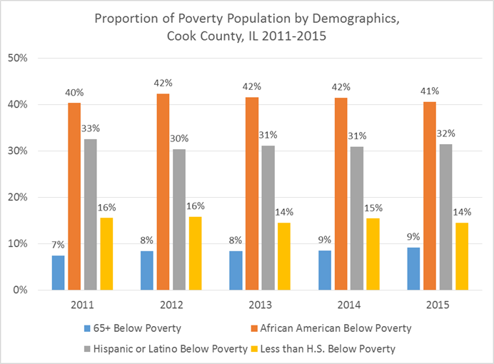
What is the poverty status of various eligible people (example: African Americans, seniors, Hispanics, and those with less than a high school education) in our service area?
Multiple Analyses Are Possible
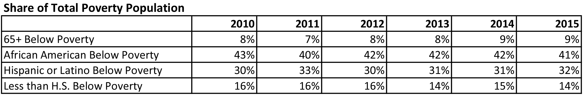
- Which vulnerable populations make up the largest share of our area’s total poverty population?
- How do these populations overlap? Should the overlap impact how we serve these populations?
Data Sources
U.S. Census American Community Survey data at the American Factfinder website (Advanced Search option)
- S1701: POVERTY STATUS IN THE PAST 12 MONTHS
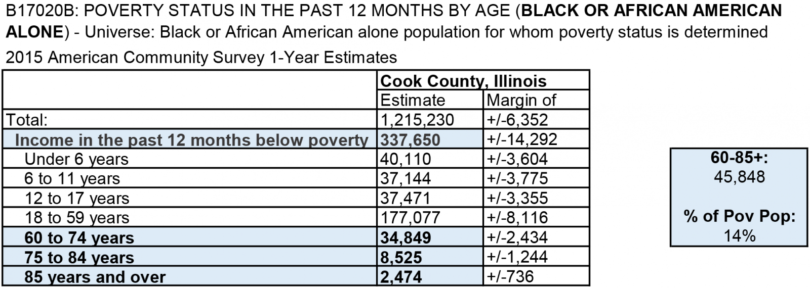
- B17020B: POVERTY STATUS IN THE PAST 12 MONTHS by AGE (BLACK OR AFRICAN AMERICAN ALONE)
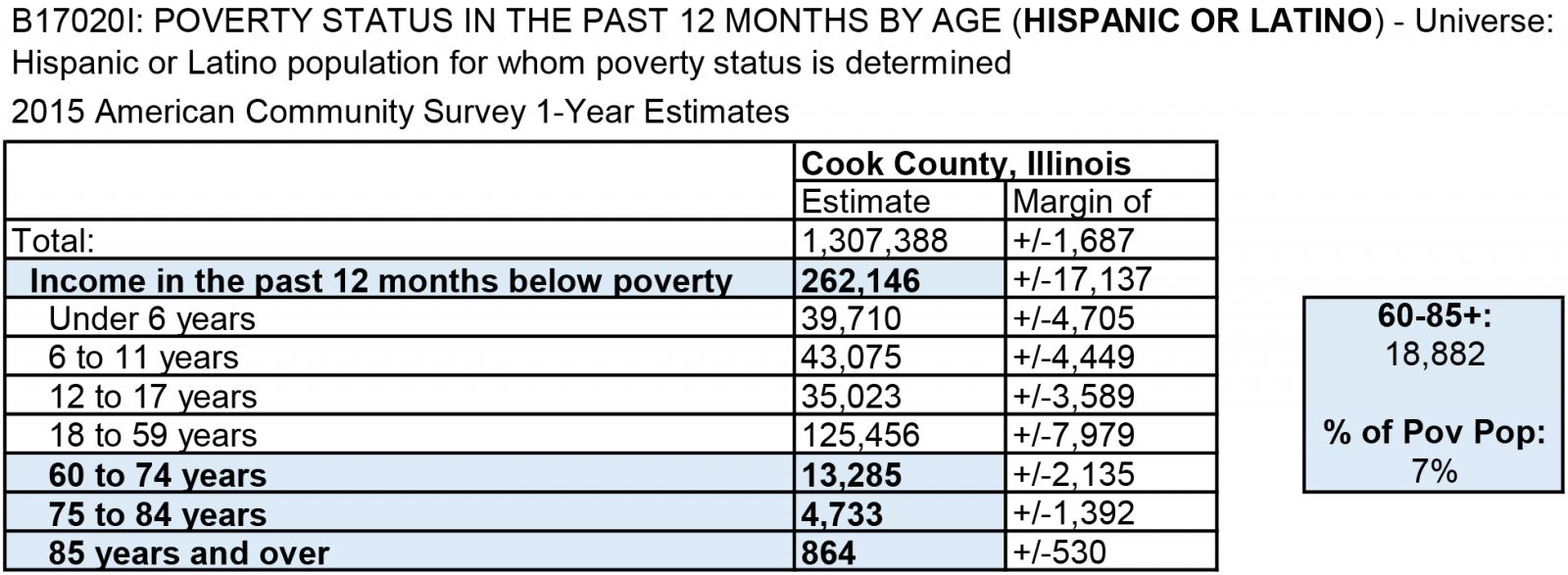
- B17020I: POVERTY STATUS IN THE PAST 12 MONTHS BY AGE (HISPANIC OR LATINO)
Example Analyses Steps
- Open the ACS, Advanced Search.
- Click on the Geographies blue box on the left side of the screen.
- Select a geographic type from the drop down (in this example geographic type is county, state is Illinois, and county is Cook County).
- Click Add TO YOUR SELECTIONS and close the Select Geographies
- In the “topic or table name” box, enter S1701 and select GO.
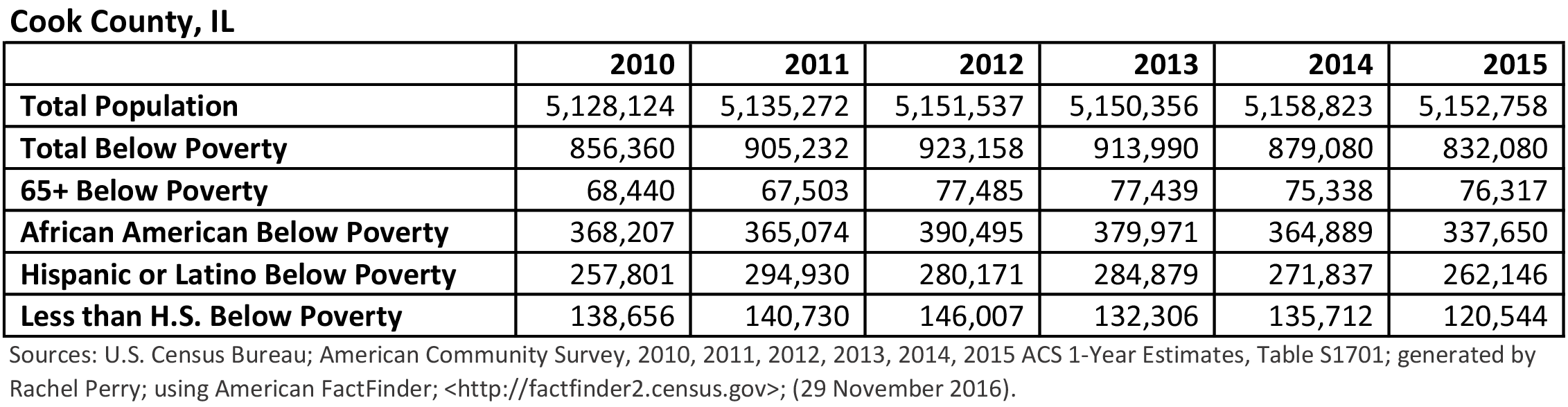
- Download the S1701 table to Excel for your area for the most recent 6 years. Because the area in this example analysis is Cook County, which has a large population, you can download the 1-year estimates.
- For information about choosing 5-year, 3-year, or 1-year estimates, click here
- Open a new Excel spreadsheet and create a table in which you copy the population counts for the total population, the population below poverty, and the below poverty population counts for the demographics you are investigating.

- Determine each demographics’ share of the poverty population in a separate table.
- Example: 65+ in 2010: 68,440/856,360 = 8%. In 2010, 8% of the people below poverty in Cook County, IL were 65+.

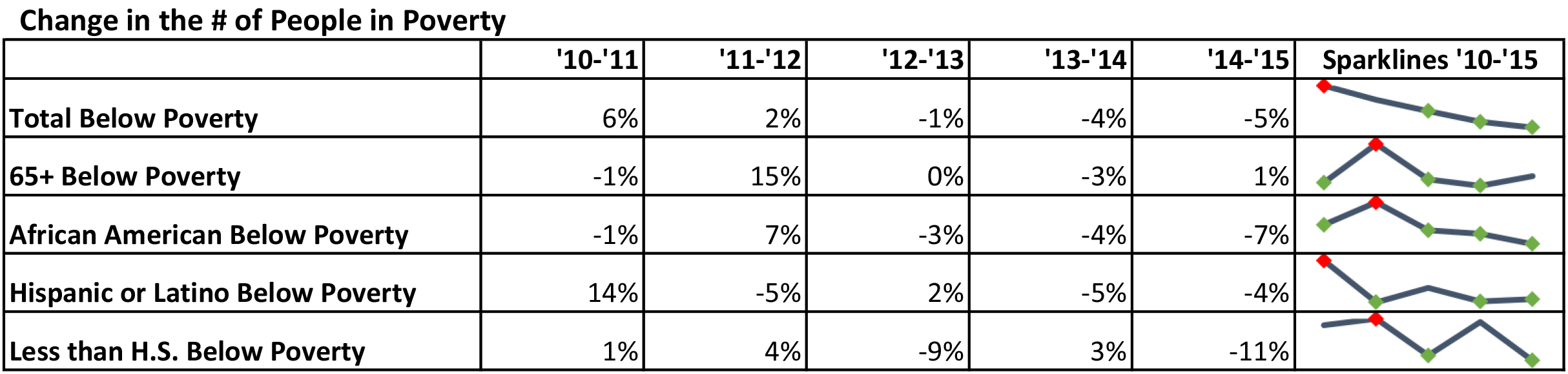
- Create a clustered column chart to show your results.

- Based on your results, you may want to dig deeper to understand more about how these populations overlap.
- Go back to the ACS Advanced Search and download the most recent 1-year estimates of the B17020B and B17020I tables to see how race and ethnicity overlap with age.
- Note that these tables show age categories for seniors as 60-74, 75-84, and 85+, which is different from that S1701 table that provided data for those 65+.
- For this example, create tables or charts in Excel that show the percentage of African Americans and Hispanics in poverty who are seniors.
- Add up the counts for 60-74, 75-84, and 85+ and divide that sum by the total for “Income in the past 12 months below poverty.”
- In this example, the data show that 14% of the African American poverty population are 60+ and 7% of the Hispanic or Latino poverty population are 60+.
- In this example, the data show that 14% of the African American poverty population are 60+ and 7% of the Hispanic or Latino poverty population are 60+.