
Data Questions
Who is eligible?
Who requests assistance?
Who do we help?
How do we help?
What resources are required?
Trend
How has the number of eligible people changed?
How have the demographics of eligible people changed?
How have the number of eligible people in your defined groups changed?
Trend
Trend analyses scrutinize changes over time in client conditions. Review trends over a five-year period, or longer when possible. Spikes or dips that appear in trends might confirm what an organization expects or raise additional questions worthy of investigation to better understand the unexpected change and determine whether it calls for proactive steps.
Example Data Question
How has the poverty status of various eligible people (ex: African Americans, seniors, Hispanics, and those with less than a high school education) been changing in recent years?
Multiple Analyses Are Possible
- How have the volume of people in poverty been changing over time? For the total poverty population and for specific vulnerable populations?
- Are the increases or decreases in the number of people in poverty different for specific vulnerable populations? If so, do we know why?
- How do the changes for specific populations compare to the total? Are the trends in the same direction? If not, do we know why?
Data Sources
- U.S. Census American Community Survey data at the American Factfinder website (Advanced Search option)
- S1701: POVERTY STATUS IN THE PAST 12 MONTHS
Example Analyses Steps
- Open the ACS, Advanced Search.
- Click on the Geographies blue box on the left side of the screen.
- Select a geographic type from the drop down (in this example: geographic type is county, state is Illinois, and county is Cook County).
- Click Add TO YOUR SELECTIONS and close the Select Geographies
- In the “topic or table name” box, enter S1701 and select GO.
- Download the S1701 table to Excel for your area for the most recent 6 years. Because the area in this example analysis is Cook County, which has a large population, you can download the 1-year estimates.
- For information about choosing 5-year, 3-year, or 1-year estimates, click here
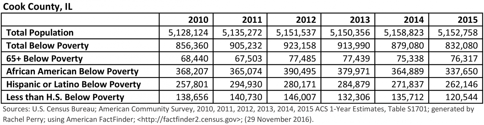
- Open a new Excel spreadsheet and create a table in which you copy the population counts for the total population, the population below poverty, and the below poverty population counts for the demographics you are investigating.
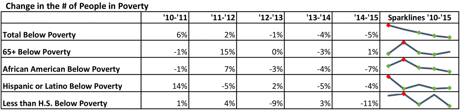
- Calculate annual % change in the number of people in poverty in a separate table and add Sparklines in the column to the right of the data.
- Example: 65+ 2010 to 2011: (67,503-68,440)/67,503 = -1%. Between 2010 and 2011, the number of people 65 and older below poverty in Cook County, IL decreased by 1%.
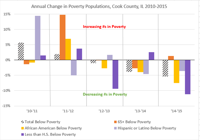
- And/or create a bar chart to show your results.
- Consider changing the formatting for the Total Below Poverty bars so that the bars for the specific subset populations are more easily compared to it (black and white striped in this example).