
Data Questions
Who is eligible?
Who requests assistance?
Who do we help?
How do we help?
What resources are required?
Geographic Distribution
Where do eligible people live?
Where do eligible people with different demographics live?
Where do eligible people from your defined groups live?
Geographic Distribution
Geographic Distribution analyses show how people or problems or anything else of interest is distributed across service areas, which can be divided into smaller areas to reveal spatial patterns. These patterns are opportunities to learn about the spatial dimensions of your organization and your clients.
Example Data Question
What is the distribution of our eligible population throughout our service area?
Multiple Analyses Are Possible
- Where are the areas with high poverty and low poverty rates?
- Where are the areas with high and low numbers of people in poverty?
- Keep in mind that looking at numbers and rates can result in very different patterns of poverty (and thus patterns of eligible population).
- You can look at broad trends (by county, or municipality), or trends closer to the neighborhood level (census tracts or block groups).
- Are the patterns of poverty as you expected, or are there any surprises?
- Any areas you expected to see different poverty levels than the data show?
Data Sources
U.S. Census American Community Survey data at the American Factfinder website: http://factfinder2.census.gov (Advanced Search option)
- S1701: POVERTY STATUS IN THE PAST 12 MONTHS, 5 year estimate, by Census Tracts
Example Analyses Steps
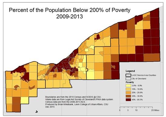
Example 1: Does the distribution of eligible population vary by community (using GIS mapping):
- Decide on your level of geography – (here, we’ve chosen the community level, except for the City for Cleveland county, where we approximated city council wards).
- If you are going to mapping your results (rather than just creating a table) you’ll need both the data file (containing poverty data) and a “geography” file that contains the boundaries of your chosen geography. In this case, the community boundaries came directly from the U.S. Census, and we created an approximate replication of the City of Cleveland ward boundaries by aggregating census tracts, also downloaded from the U.S. Census.
- We calculated the percent of the total population of each location living below 200% of poverty.
- The darker the colors on the map, the higher the percentage of that community’s population that are eligible for Legal Aid services.
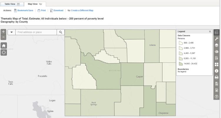
Example 2: Does the distribution of eligible population vary by community (using American FactFinder Built-In Mapping):
- Open the ACS, Advanced Search:
- Select your geographies (in this example: geographic type is county, state is Wyoming, geographic area is All Counties within Wyoming).
- Select your topics (suggested table: S1701 Poverty Status in the Past 12 Months, 5-year estimates).
- Select the latest available 5-year estimate and run the report.
- With the results visible, click on Create a Map.
- A message will pop up instructing you to click on a data value in the table to map. In this example, we scrolled down to the row called “200 percent of poverty level” and clicked on the number in the first Estimate column. Then click Show Map.
- You can download the map as a PDF or JPEG